
Most brands are designed for what the company looks like today.Then a year later, new products launch, new designers get involved, the website changes, packaging gets updated - and suddenly the whole thing needs to be redesigned again.
We build brand systems designed to last.Your identity, packaging, typography, colors, layouts and visual rules are built so the company can keep adding products, campaigns and channels without reinventing itself every time.
Launching something new? Rebranding something established? Either way, we are designing for what comes next.
Future proof metric to build toward: $X IN REBRAND COSTS AVOIDED.

Most branding projects solve the assignment sitting in front of the designer. One logo. One product. One package. One website. It looks great. Until the next thing gets added. Product two needs a different color. Product three needs another packaging format. Retail needs a new hierarchy. The ecommerce team needs digital assets. Another designer joins the company. Six months later, nobody knows what is actually "on brand."
That isn't growth. That's brand debt.
Every inconsistent decision creates another decision the business has to pay somebody to solve later.
The logo is not the expensive part.
It is every package, render, ad, landing page, email template, retail asset, photo shoot and piece of collateral that has to change with it.
New identity.
New packaging.
Website no longer matches.
New SKU architecture.
Another rebrand.
A scalable brand lowers the cost of everything you create after it.
The goal isn't consistency for consistency's sake. The goal is making growth easier.
Know what the brand needs to mean.
Before the logo, we clarify the customer, market, competition, product position and reason someone should care.
Create something people can recognize.
Logo, wordmark, color, typography and visual language that make the brand distinctly yours.
Turn design decisions into rules.
Layouts, hierarchy, graphics, photography, type treatment, spacing and visual principles that allow somebody besides the original designer to create on-brand work.
Build the product architecture.
The hero product should not exist in isolation. We design packaging that can extend across flavors, sizes, formats, product categories and future SKUs.
Make it real-world ready.
Dielines, labels, hierarchy, regulatory information, production artwork, print specifications and supplier-ready files. Not just beautiful mockups.
Prove the system can grow.
Apply the identity across the website, ads, packaging, renders, launch assets and future products. If every new asset requires inventing a new visual language, the system was not finished.
We don't hand over a logo and make the next designer figure out the rest.
Positioning direction; logo / wordmark; secondary marks; typography; color system; graphic language; iconography; photography direction; art direction; brand guidelines.
Hero product design; packaging architecture; product-family hierarchy; SKU differentiation; label design; direct-print artwork; outer cartons; material and finish recommendations; retail considerations.
Supplier dielines; print-ready artwork; barcode placement; ingredient / INCI hierarchy; regulatory-information hierarchy; required symbols; prepress preparation; supplier handoff.
Product renders; ecommerce assets; website application; social visual system; campaign direction; launch assets; future-SKU templates.
Identity, packaging and product systems we have built for brands with somewhere to go.
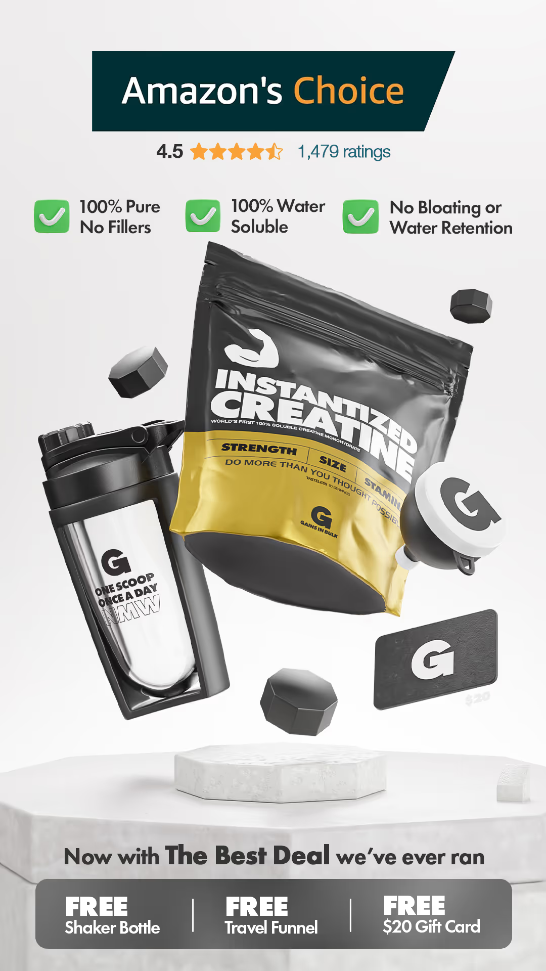
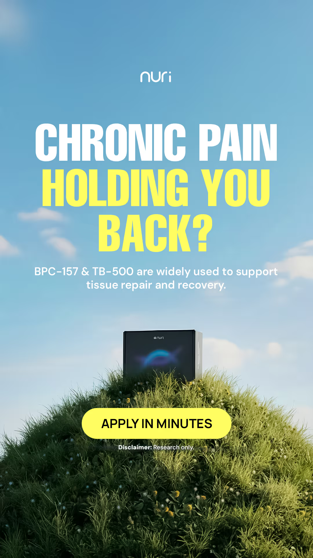
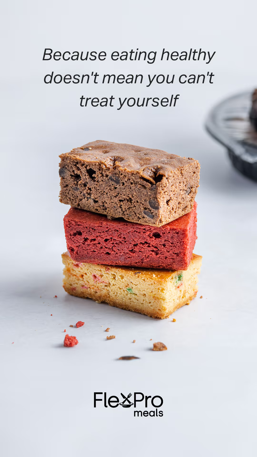
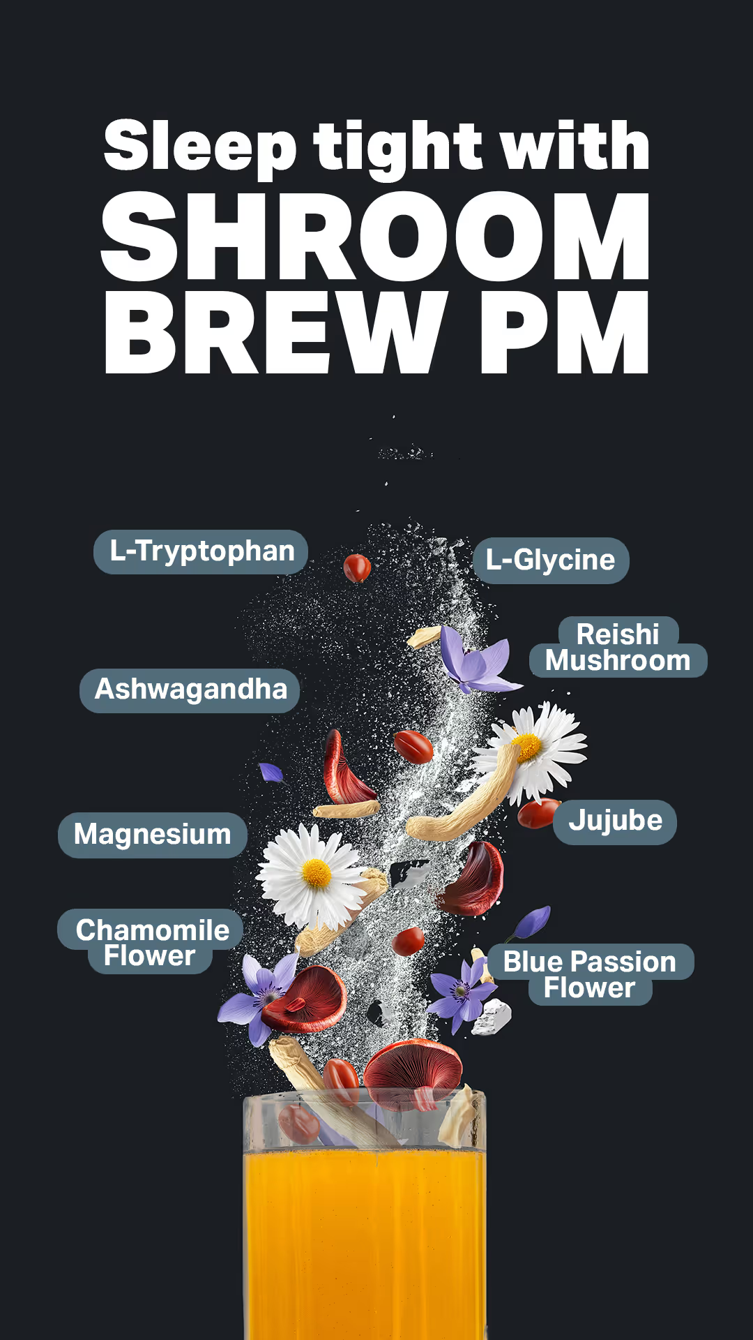
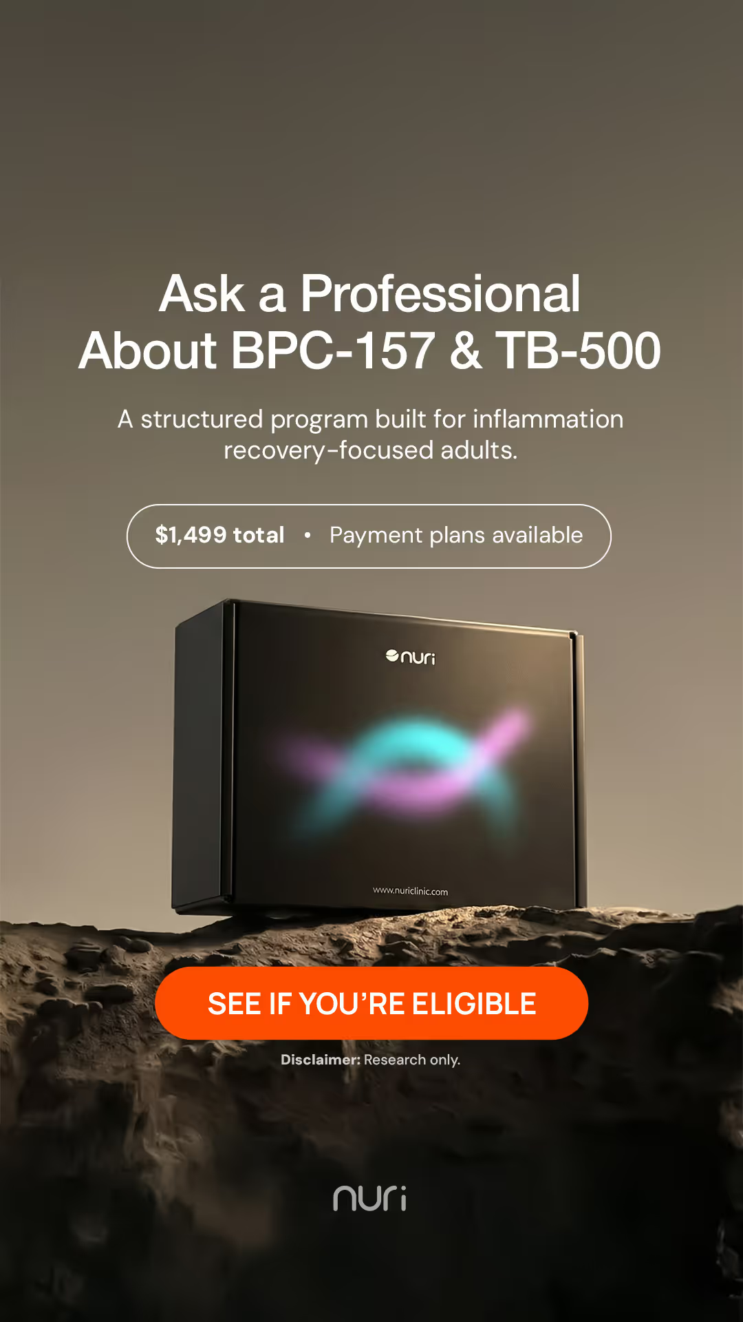

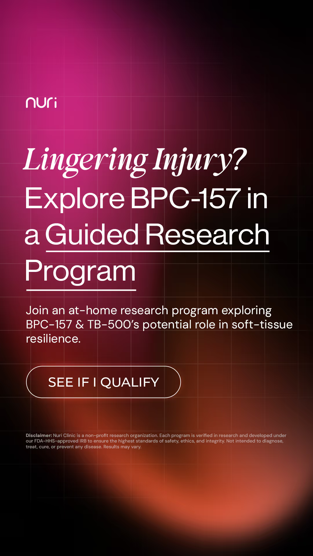
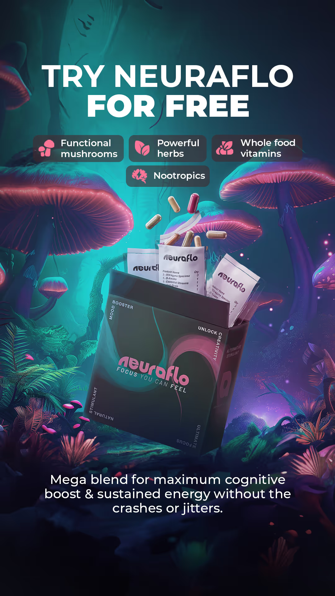
The real test of a brand system comes after launch - when the company starts asking it to do more.
5+ YEARS on the core brand system. 2+ YEARS on the current packaging system. X+ SKUs added without rebuilding the brand. New flavors, products, campaigns, pages and creative keep expanding from the same recognizable system.
2+ YEARS on the core brand + packaging. X+ products / offers built from the same system. Multiple channels, one visual language. From program packaging and renders to ecommerce, education and acquisition creative, Nuri keeps building from the same foundation.
5+ YEARS on the same core brand system. Corn and flour packaging families show the system flexing across flavors, sizes and structures while staying unmistakably recognizable as the assortment expands.
Use the supplement packs box, multi-panel information hierarchy and individual pack presentation as proof that SOD can carry one visual system through the complete physical product experience. Keep this proof visual unless stronger business metrics become available.
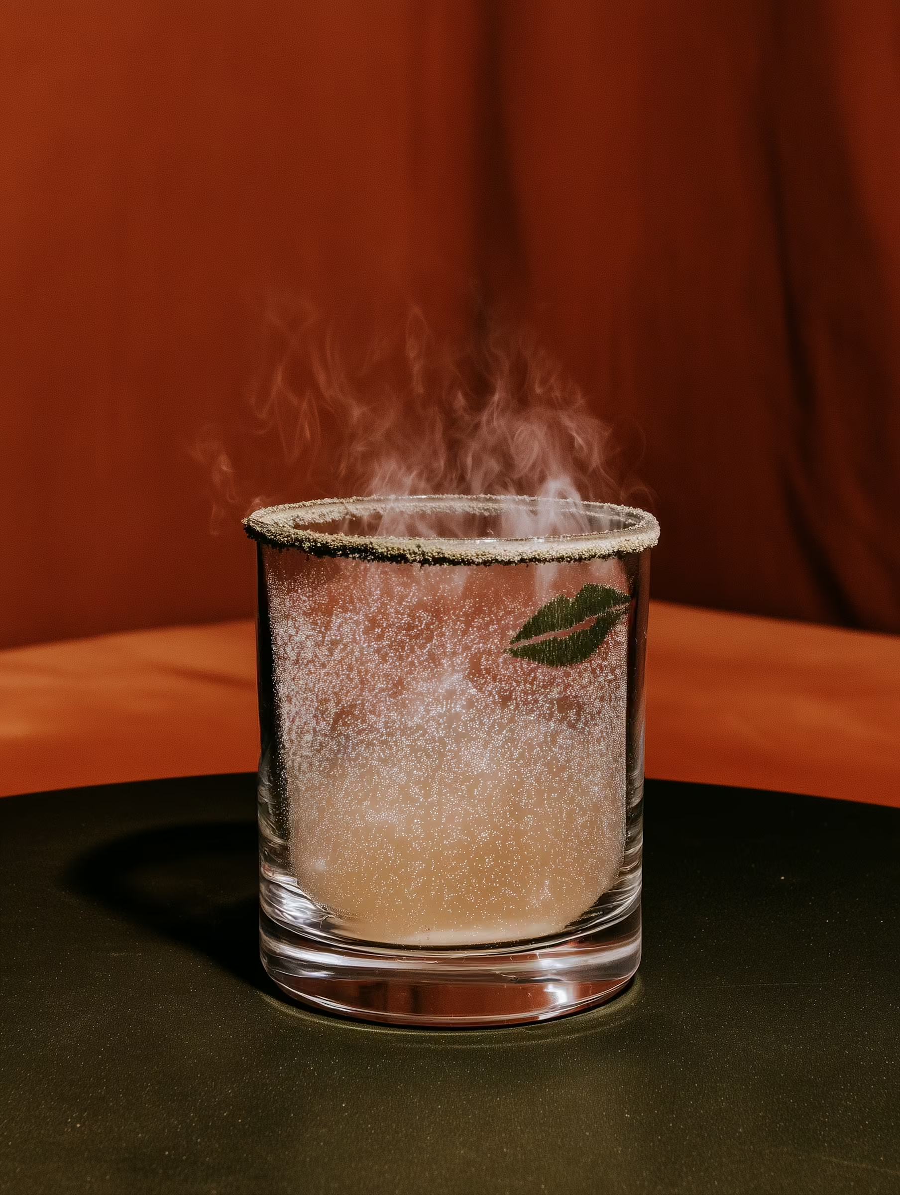
What would the business have spent redesigning, repackaging and rebuilding assets if the original system stopped working every 18-24 months?
Traditional branding case studies tell you: "Here is the logo."
We want ours to eventually tell you: "This system has supported 27 SKUs, five channels and four years of growth without requiring another rebrand."
The longer the system works, the more valuable the original investment becomes.
Your brand may look fine today. The better question is whether it can handle what the business wants to become tomorrow.
Is the brand recognizable without constantly reinventing itself?
Can internal teams and outside designers create new assets without guessing?
Does the same brand work across web, social, email, ecommerce and advertising?
Can new products be added without redesigning the entire packaging system?
Does the packaging system actually work across formats, suppliers and real-world production?
How much future redesign work is the current system quietly creating?
Takes about three minutes. Your logo may not be the problem.
If you are launching something meant to become bigger than one product, let's build the identity and packaging system for the company you are becoming - not just the company you are today.
Brand. Packaging. Production. One system built to grow.